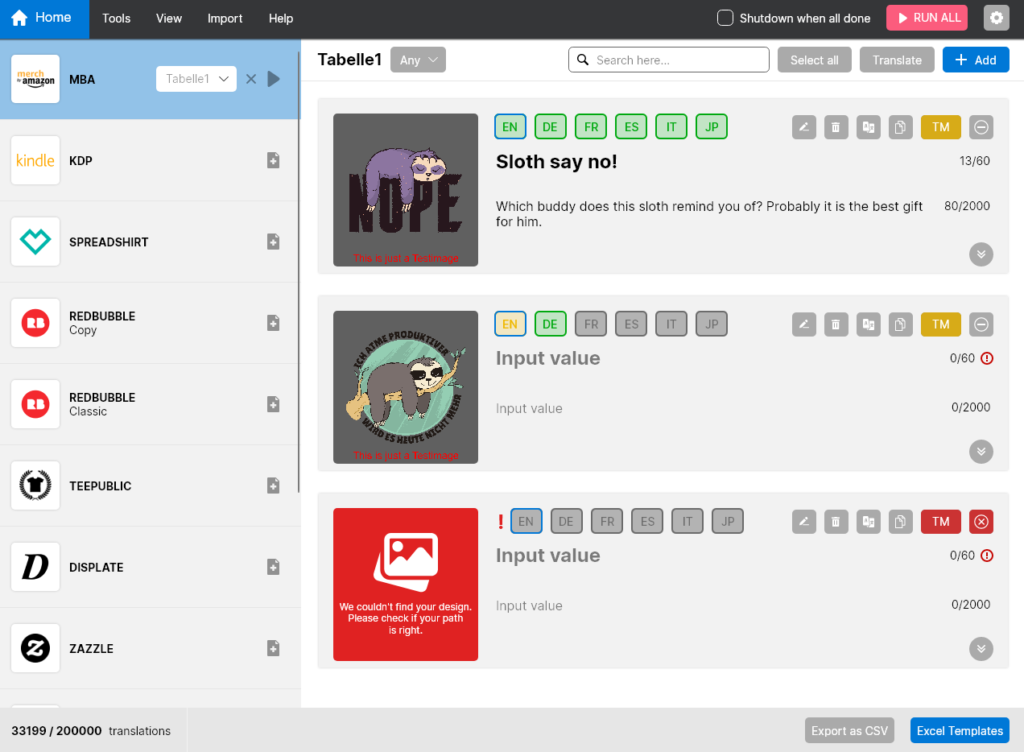
Our user interface is designed to support you as best as possible in your work and to guide you through the processing of your listings with tips as well as error messages.
By means of colors, tooltips and error messages you can draw first conclusions about where you have to change something so that everything works properly.
Colors
Be it the language labels, the TM button or the expand buttons of the table view, they all give information about whether something has to be considered or not. It works according to the traffic light system, which results in the following meanings:
| Language Label | TM | |
| Green | Everything is OK. The listing meets the requirements. | You’re good to go, no trademarks have been found |
| Yellow | Warning, you can upload, but make sure if the marked areas need a change. | Trademarks have been found. Better check them! |
| Red | Error, the upload is not possible. Inputs are missing, the design is missing or there are incorrect inputs. | TM check wasn’t possible. Check your listing and settings. |

Tooltips & Hints
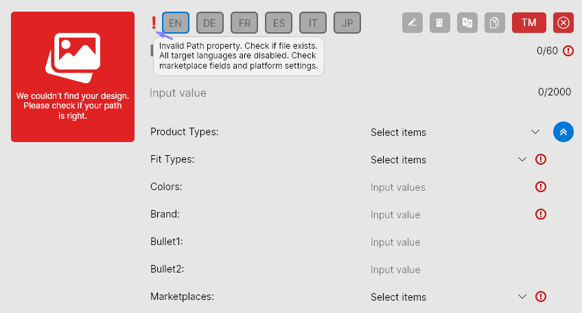
Exclamation marks or warnings pop up all over the tool if something is not filled correctly or inputs are missing. As a supplement to the colored signals, you can hover over affected areas almost everywhere with the cursor to get a hint about what is not working. As seen in the example below, hovering over the large exclamation mark alerts us that the design file is missing, all languages are disabled for this platform, and inputs are incorrect or missing.


